
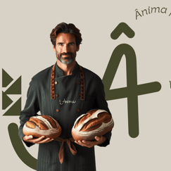
Ânima Artisan Bakery
Visual Identity
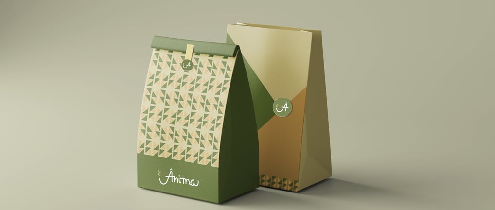
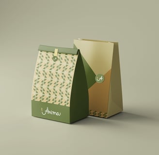
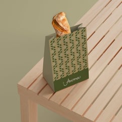
Ânima is an artisanal bakery brand built on care, personalization, and affection.
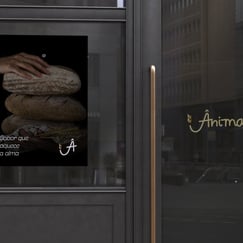
"Anima" means soul in Italian, which is a key element of the brand—the soul. The breads are 100% handcrafted, made with slow fermentation, the kind of bread that, when eaten, feels like a warm hug for the soul.
The typography was handcrafted, using the handwriting of one of the brand's co-founders, then vectorized for the project, reinforcing the artisanal feel, just like their products.
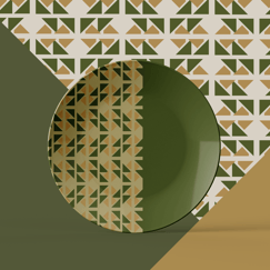
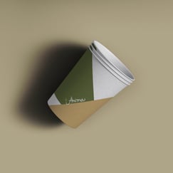
The symbol represents a wheat stalk, the foundation of the bakery’s products.
And the fonts further enhance the feeling of calm, warmth, soul, and bakery essence.
Project developed by Bruna Be Design for the brand Ânima in April 2024.