
Athluxe Streetwearr
Visual Identity
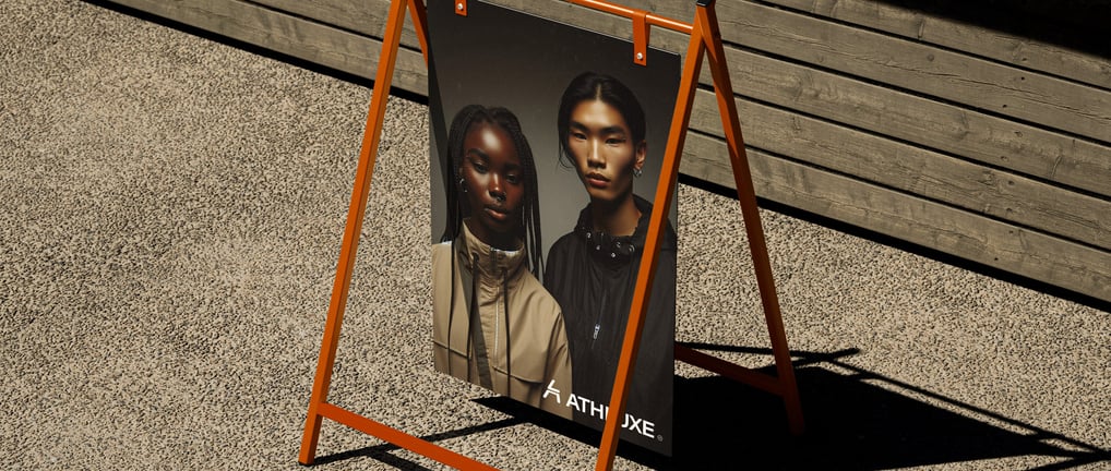

The name Athluxe is a combination of Athletic and Luxurious, two words that well represent the duality of the brand.
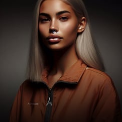
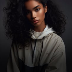
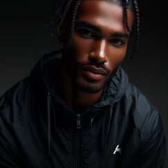
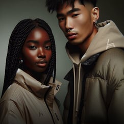
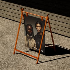
It's an urban brand for those who live the street life, seeking to feel comfortable and always well-dressed.
Athluxe is modern, disruptive, bold, and strong, but with an important touch of elegance and simplicity.
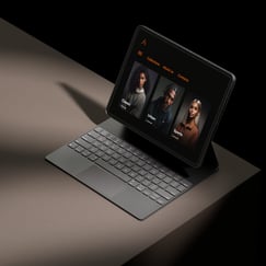
With this in mind, the font used is simple, minimalist, and with closely spaced letters, bringing a sense of strength and modernity.
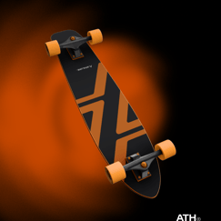
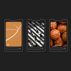
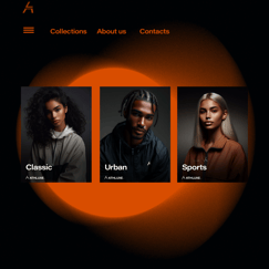
The colors are inspired by sports, and since basketball is one of the main references—given its style closely aligns with the brand—the colors of a basketball were chosen.
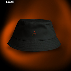
In the symbol, the letters A and L from Athluxe are used, with the lower part of the letter A designed to resemble the lines of a basketball court.
Project developed by Bruna Be Design for the brand Athluxe in July 2024.