
Gaia Premium Granola
Visual Identity
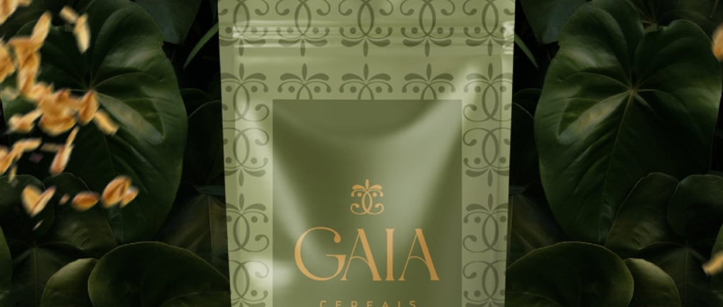
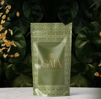
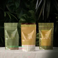
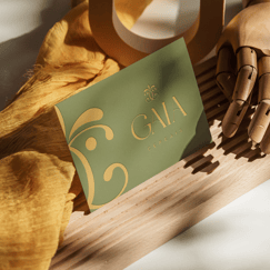
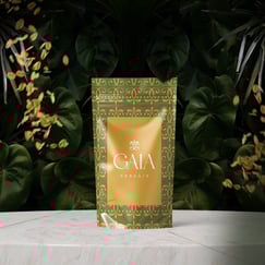
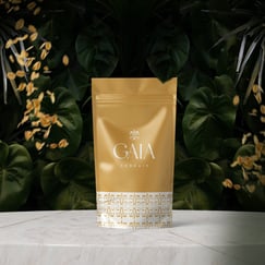
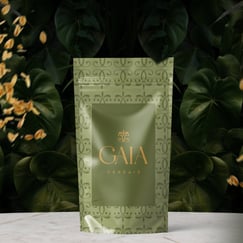
Gaia is a brand in the cereal segment.
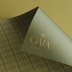
With a clean and natural essence, the creation of the symbol was built from the idea of using the letter "G." There are two mirrored "G's" that, when combined, form a fluid and elegant element. To add an even more elegant touch and bring inspiration from nature, three flower petals and two dots were applied in each "G," symbolizing cereals.
The colors used aim to bring nature and elegance.
The font used in the logo is strong yet delicate, aligning with the delicacy of the rest of the project but adding a point of strength to the brand.
Project developed by Bruna Be Design for Gaia Premium Granola brand in September 2023.