
My Summer Cosmetics
Visual Identity
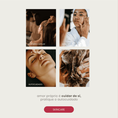
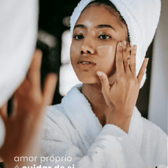
My Summer is the perfect blend of delicacy and elegance, combined with happiness and positive energy.
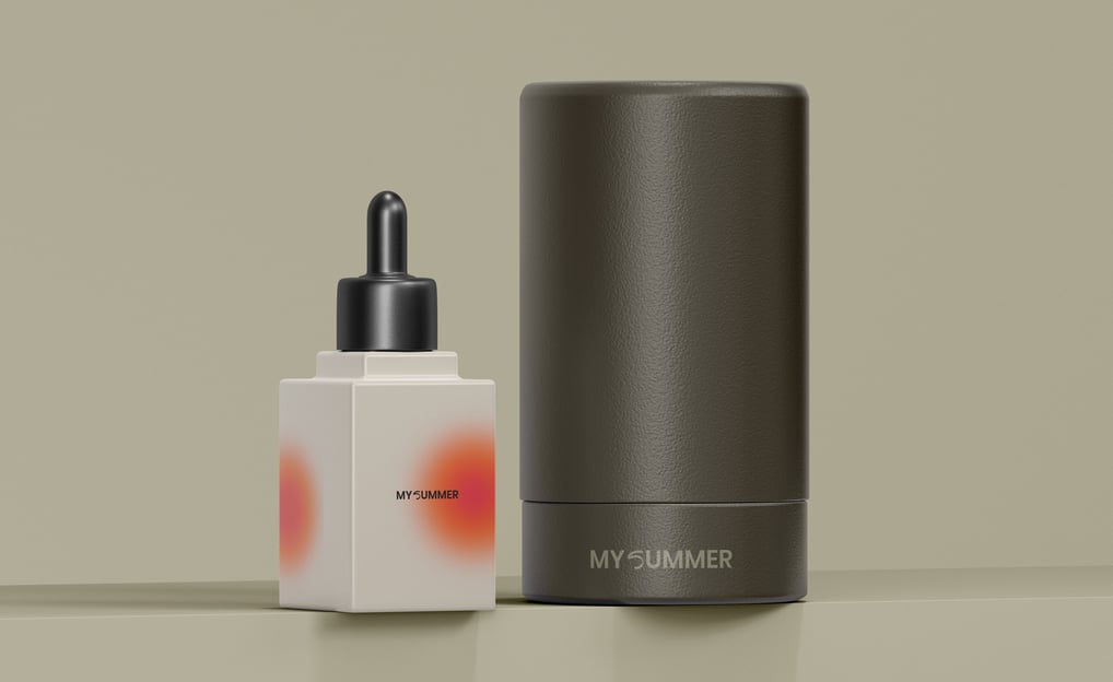
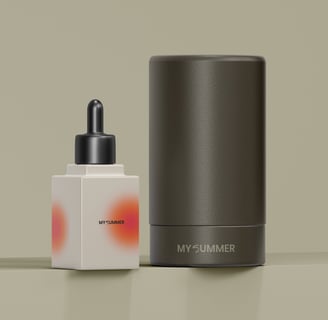
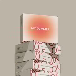
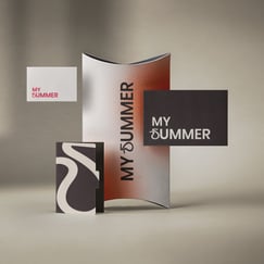
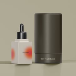
With this in mind, the brand predominantly features neutral tones like nude and off-white, while shades of pink serve as accent colors, adding the feminine and uplifting energy that defines its essence.
The typography is clean and minimalist, with one letter incorporating the shape of a drop, adding a playful touch.
The drop symbolizes summer, as well as the brand’s products, which come in cream and liquid forms. It also conveys a sense of lightness and subtly represents the letter "S" for Summer, in an elegant way.
Project developed by Bruna Be Design for the My Summer Cosmetics brand in November 2024.